|
From typography, I learned that you can create different fonts and learn it by refonting the words so that it'll fit the design of what you are designing. I learned that usually, different companies use different fonts to match the kind of name as their own company. It's important because it can attract attention from different people. The meaning of "Each font has a personality and a purpose" is that the different styles of fonts has a purpose to attracting a certain group of people by their personality. This unit, we learned about Serif, Sans serif, monospaced, handwriting, and novelty. Serif is the text with a small feet. It's probably used for important letters and projects. Sans serif is Serif but without feet. It's mainly used for casual subjects like sending a text. Monospaced is where each letter takes up the same amount of space. You can use Monospaced but it's hard to read yet looks kind of futuristic. Handwriting is the text where the letters are connected. Lastly, Novelty is a special type of font that doesn't fall into any category. Typeface comparison.In the Typeface comparison, you were supposed to use one word and use it in different text fonts. Then on top of it, you would write down the type of font you were using. 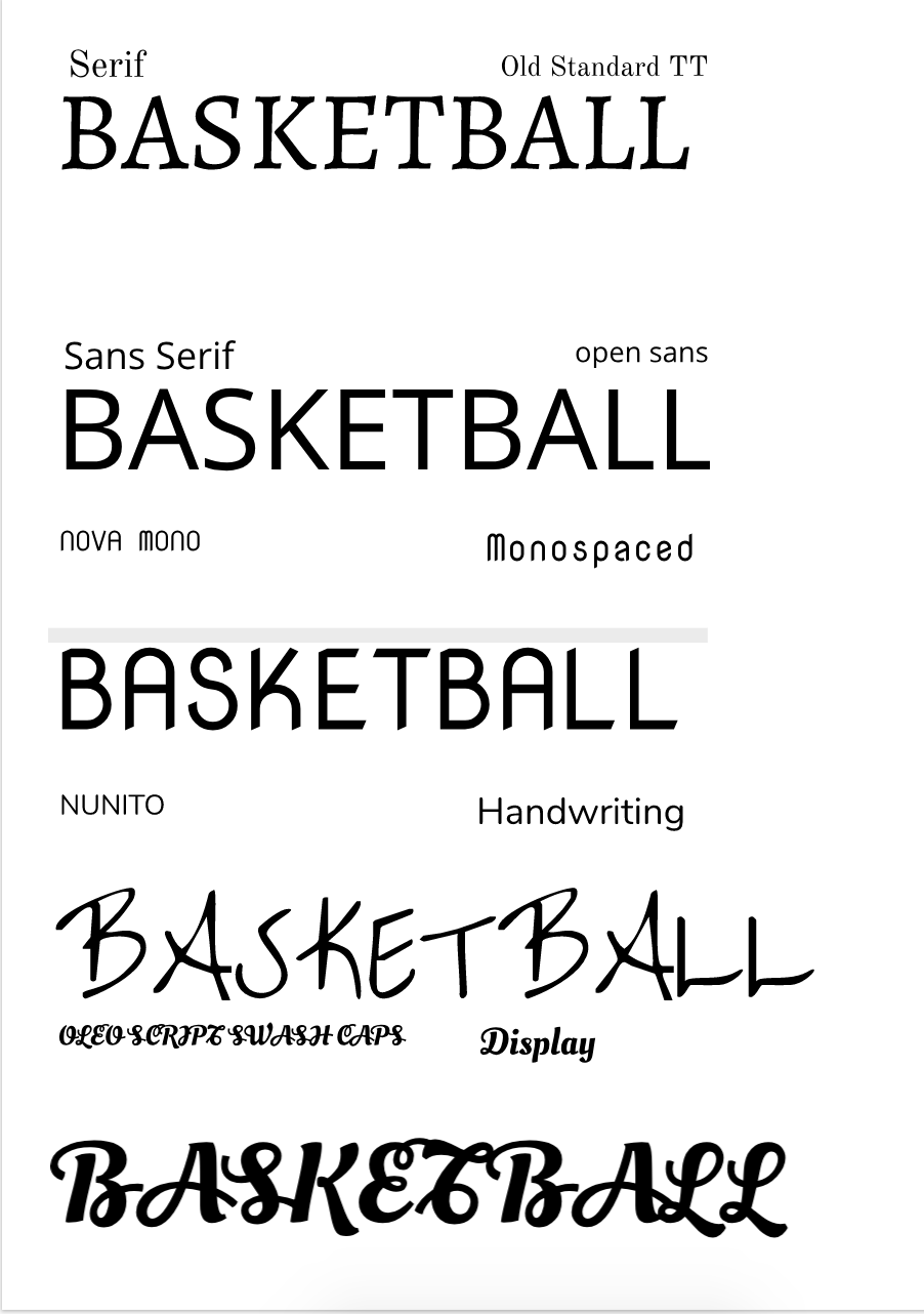 Word PortraitsOn one side of the Word Portraits, you had to write one subject and write the opposite of what the subject is based off the text fonts. The different the text font, the different the wordings would change. 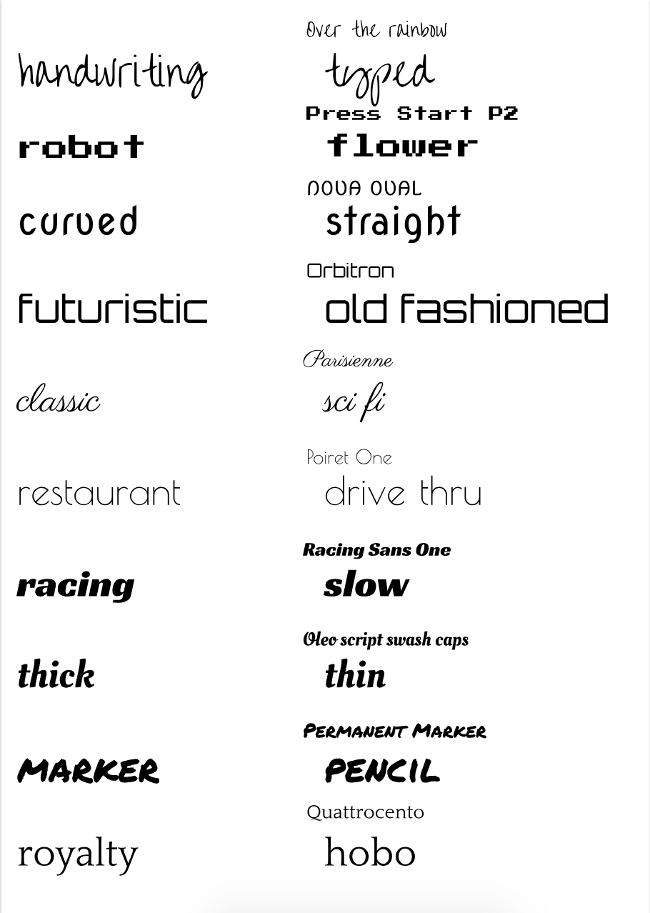
0 Comments
Leave a Reply. |
AuthorI want to achieve a goal to make sure that people will learn the basics on some of the games I play. Archives
May 2019
Categories
All
|
 RSS Feed

