|
0 Comments
In this activity, we were supposed to choose three different Logos and draw them out in Gravit. The Most difficult part of the design was changing the black parts from drawing to different variations of colors. My favorite part of this unit was to draw in Gravit because it really showed us that we have potential in being able to create much more. One thing I noticed was when we had to choose the three logos. At first, I really enjoyed my goat design, but over time, I started getting a fond of my other logos.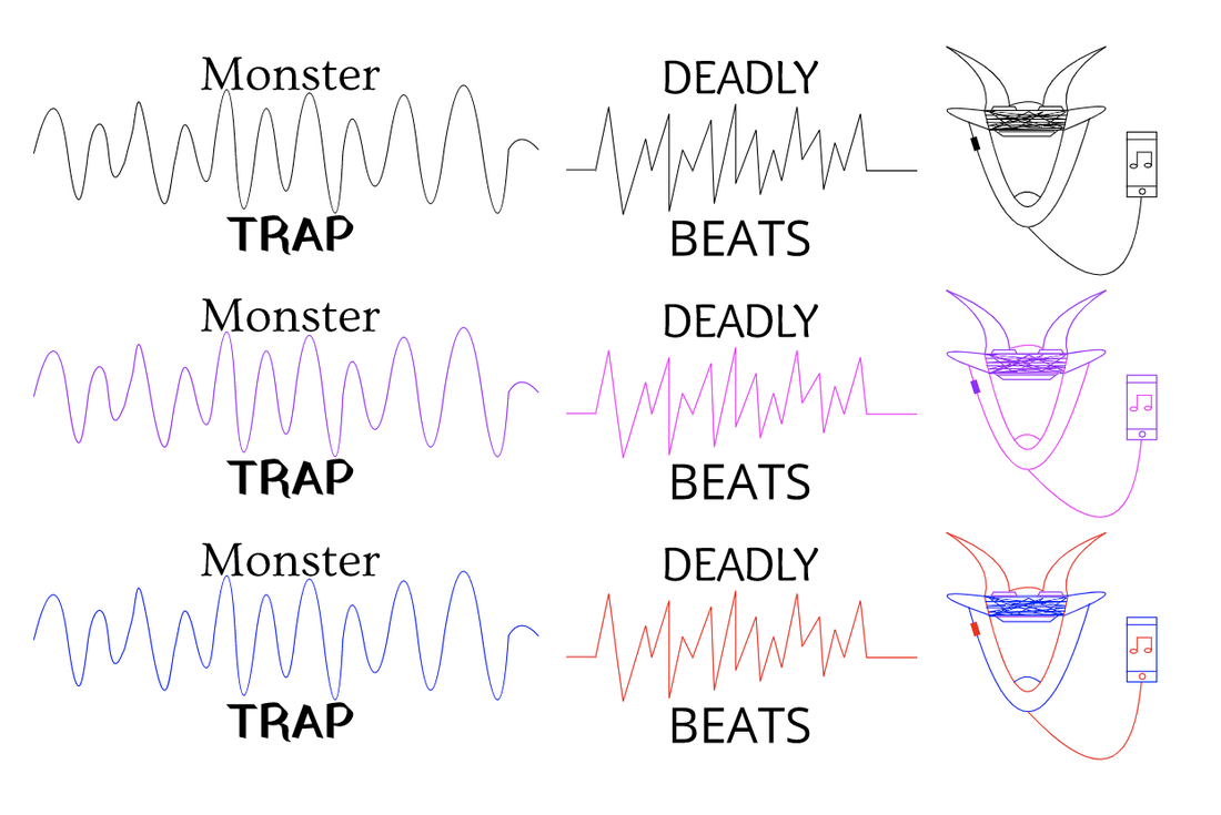 The name of the brand I created is Goat Music. I decided to make it Goat Music because Goat can also stand for Greatest Of All Time. This logo Identifies my brand to be more popular, and most used because it resembles to be very modern. This is my favorite Logo because it was more creative and it had more effort shown in it. 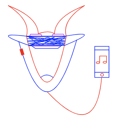 In this logo brainstorm, we had to find some words and sketches that described what the company would be. In my example, I wanted to start a company like a music industry. I chose a Goat listening to music because Goat also means Greatest of all time. The other two logos I chose brought me vibes of the music beats. Finding 15 words for my topic was a bit difficult but it was ok overall. I thought that finding 15 logos for my design was fun and interesting as I had to find creative ways to bring out what layout I would want for my graphic design would be. 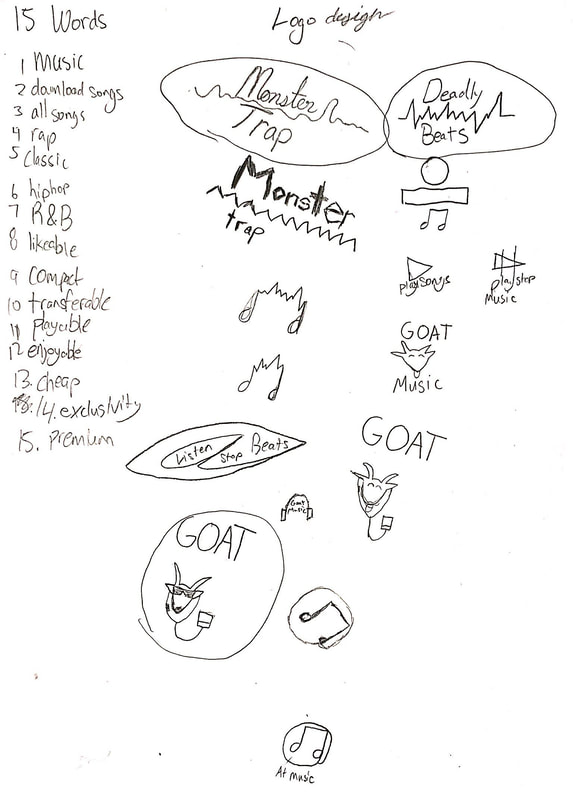 In this summative assignment, we were asked to make four different color palettes that include at least 5 colors. We needed to create the palettes, one having monochromatic, one having analogous, one having triadic, and one with complementary. Then, we were able to give a choice between what design we could make for this design project. I chose to use bee hive like hexagons representing the different types of colors that use HEX codes. The numbers with the hashtags contain these HEX codes containing different kinds of colors using this code HERE was the site we used to find the different kings of Color schemes. The first color scheme was monochromatic. This has only one hue, and various levels of saturation and brightness. The second is analogous. This color scheme contains hues that are next to each other in the color wheel. In the complementary color scheme, it combines hues from the opposite side of the color wheel. Lastly, the triad color scheme combines 3 hues evenly spaced around the color wheel. Personally, my favorite color scheme is the analogous. I like this because the colors seem neat around each other, and they don't seem too mixed up. 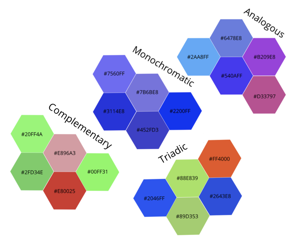 In this new unit, we learned color names on computer. We had to make 15 designs replicated and filled with different colors and finding the RGB and HEX code. With these codes, we had to label it either within the shape or next to the shape. I made 3 different rows of 5 circles. Some of the challenges I interfered within this work is to find the perfect font to fit in the RGB/HEX codes within the circle. The other challenge I interfered within this project is aligning all of the circles to order and line them up. The concept of this design is the hammer hog. Where you hammer things that pop up from the machines. It resembles a lot of randomness. 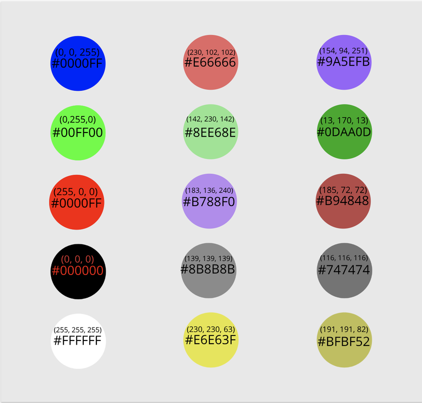 From typography, I learned that you can create different fonts and learn it by refonting the words so that it'll fit the design of what you are designing. I learned that usually, different companies use different fonts to match the kind of name as their own company. It's important because it can attract attention from different people. The meaning of "Each font has a personality and a purpose" is that the different styles of fonts has a purpose to attracting a certain group of people by their personality. This unit, we learned about Serif, Sans serif, monospaced, handwriting, and novelty. Serif is the text with a small feet. It's probably used for important letters and projects. Sans serif is Serif but without feet. It's mainly used for casual subjects like sending a text. Monospaced is where each letter takes up the same amount of space. You can use Monospaced but it's hard to read yet looks kind of futuristic. Handwriting is the text where the letters are connected. Lastly, Novelty is a special type of font that doesn't fall into any category. Typeface comparison.In the Typeface comparison, you were supposed to use one word and use it in different text fonts. Then on top of it, you would write down the type of font you were using. 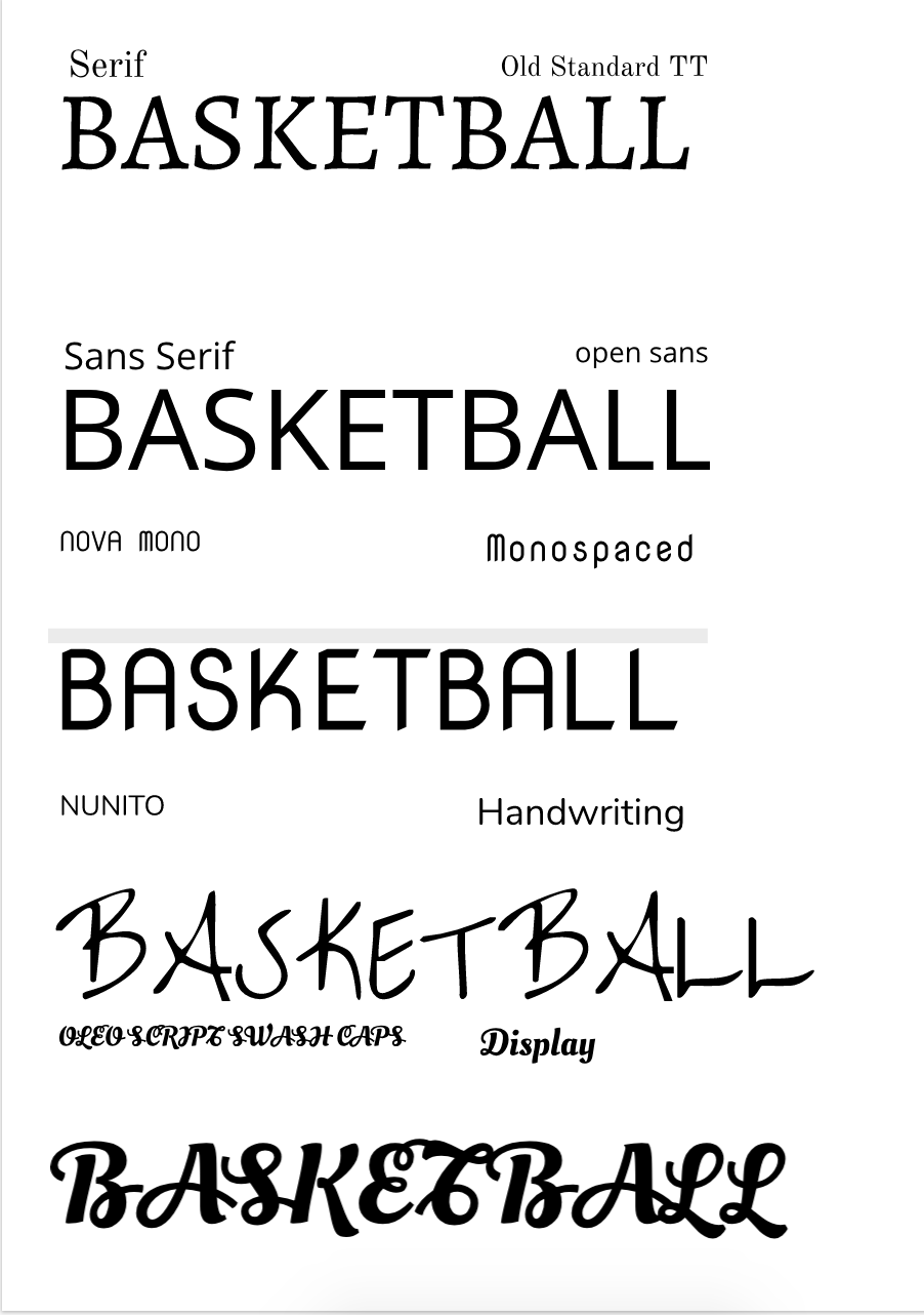 Word PortraitsOn one side of the Word Portraits, you had to write one subject and write the opposite of what the subject is based off the text fonts. The different the text font, the different the wordings would change. 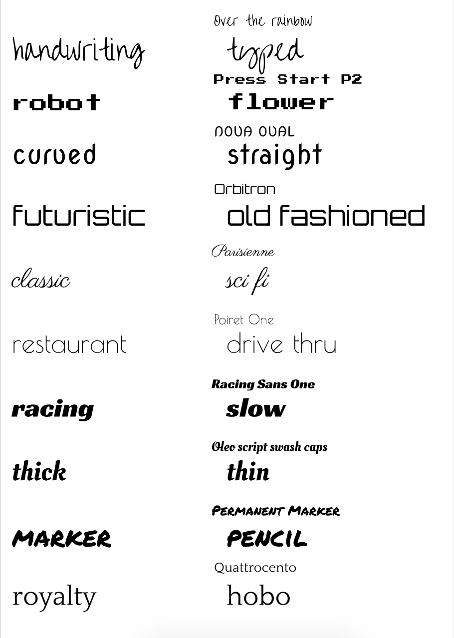 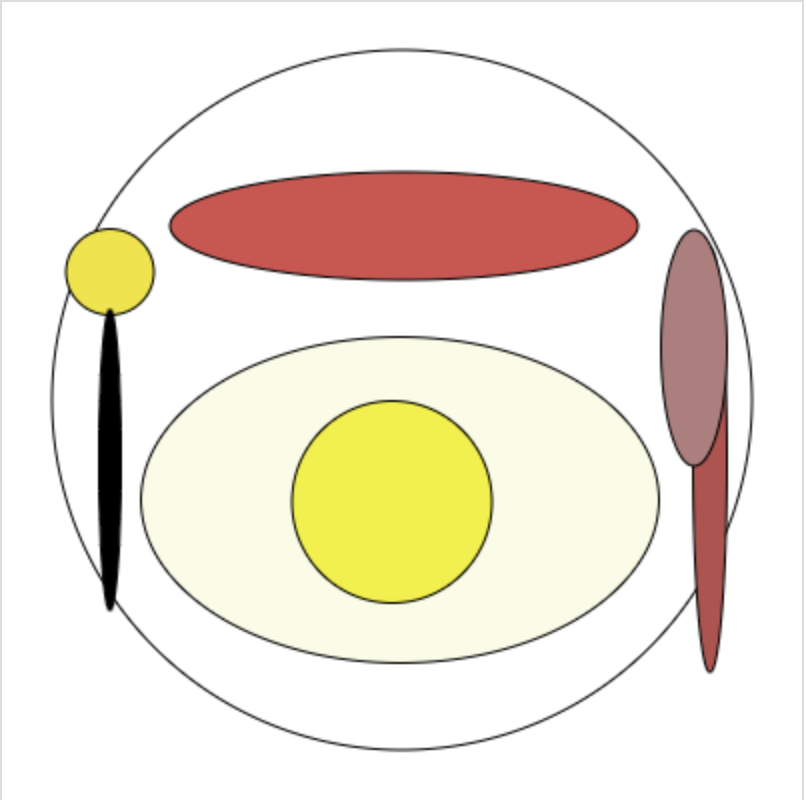 I made this code using kahn academy. I was able to learn that coding and drawing can be very fun to code when you start coding. The reason why I made this photo is to share the pictures on how to make the egg, they are both ellipsed with the yolk and the outer part, the sausage, also used with ellipses. To be honest, all of these shapes are made of circles, but this proves that you can make any shapes with this basic shapes. The spoon and knife were also made with ellipses. Now here is the code. background(255, 255, 255);
fill(255, 255, 255); ellipse(200, 199, 350, 350); // plate fill(250, 252, 229); ellipse(199, 249, 259, 163); // EGG fill(214, 77, 77); ellipse(201, 112, 234, 54); //SAUSAGE fill(242, 242, 5); ellipse(195, 250, 100, 101); // YOLK fill(240, 229, 29); ellipse(54,135,44,43); fill(0, 0, 0); ellipse(54, 229, 11, 150); fill(184, 77, 77); ellipse(354, 229, 17, 212); fill(179, 125, 125); ellipse(346,173,33,118); |
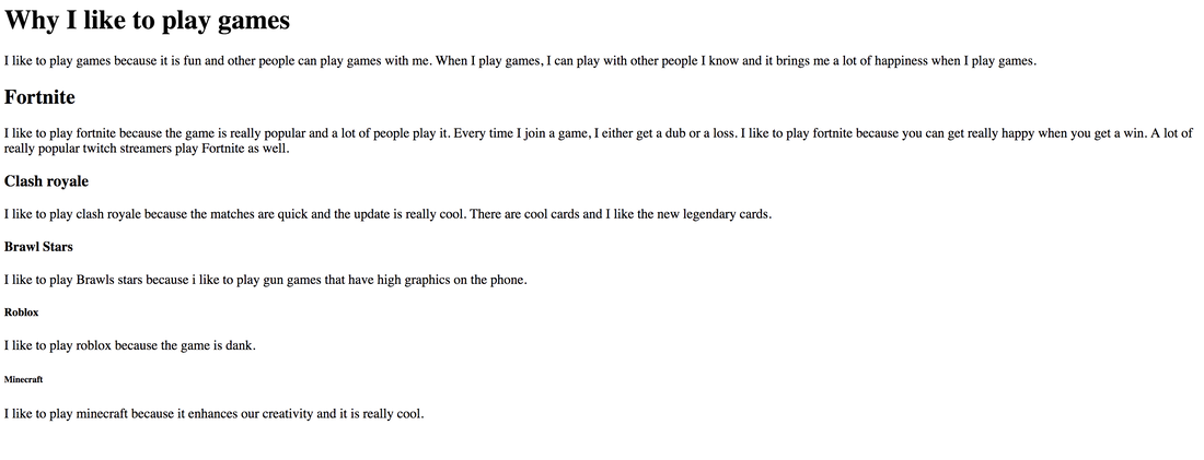
AuthorI want to achieve a goal to make sure that people will learn the basics on some of the games I play. Archives
May 2019
Categories
All
|
 RSS Feed

